Directions for Wedding!
This weekend, I bothered Irman with one more task. Actually 3, but managed to complete one. Design a directional poster so that we can direct our guests to our wedding venue. Something of a ‘peachy’ tones. Photoshop is really amazing – you can almost do anything and everything with it!
Here’s the simple fact why we need one: signage attracts attention. Think back to any event you’ve gone to, outdoors or indoors. From a grand welcome sign to a simple directional sign, it’s important to provide these visuals.
So, we plan to use signage to achieve higher attendance as well as to guide our guest to the event venue. Before the wedding takes place, I have already planned and assigned the man in the family to look into this on the day before our wedding. They will have to strategically place these signages to get the word out and very importantly, guide our guests.
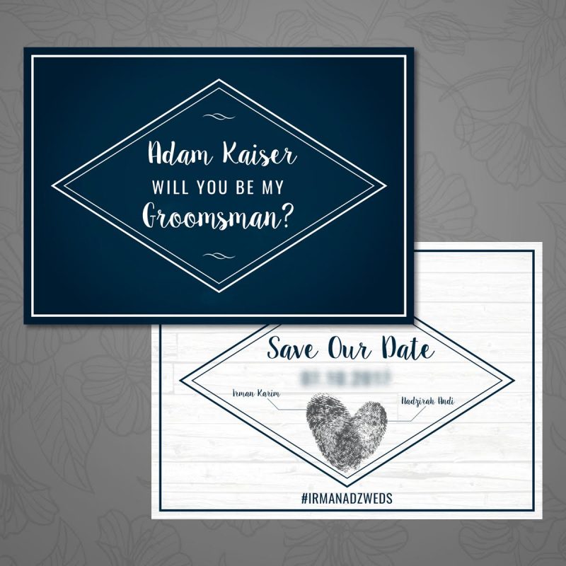
We made sure our design is clean and creative signs used during our wedding. I may insist on putting inPixelHaus namecard at the back of each foamboard to kinda market Irman’s small sideline business. These signage will help to showcase future clients.
Of course, you can use signs simply for directional purposes. Weddings especially can be hectic and confusing. Communication is always key; communicate to our visitors and give them an easygoing and enjoyable experience at our wedding.
With that, here is what we came up with – simple and purposeful! Once again, I couldn’t thank Irman enough for all the designing works he has done for our wedding. He really helps me realise my own fairytale wedding, and lucky him I am a happy client of his. I may have many assignments for him (FOC) but I am easy to be pleased w his workmanship. Bravo love!


